Previous Project –
California State Library
Redesigning California's information architecture.
California State Library
The California State Library is the centralized hub for all of California's perserved history and valuable reference resource for the state government.
OVERVIEW
California's head librarian, Greg Lucas, asked UCLA's GSEIS students to improve the UX of their website. There was a team of 5 that revamped the California State Library's website.
ROLE
UX Designer
Visual Designer
Modernizing an historic website for the Golden State
Goal
Our goal was to provide a preliminary plan to refine the site navigation and visual design to improve the user experience for their patrons.
Problems
1. Too many pages on the website. The CSL website had over 600 pages available to patrons visiting the site. Many of these pages have duplicated information that need to be consolidated, some of them are rarely visited and need to be archived or deleted, and others are PDFs that haven't converted to web pages.
2. Poor navigation of the website. This is partly due to the amount of pages the website has, and partly due to a confusing organizational structure. Other contributing factors to the poor navigation are pages that lead to PDFs, pages that do not indicate to users how to continue moving through the site, etc.
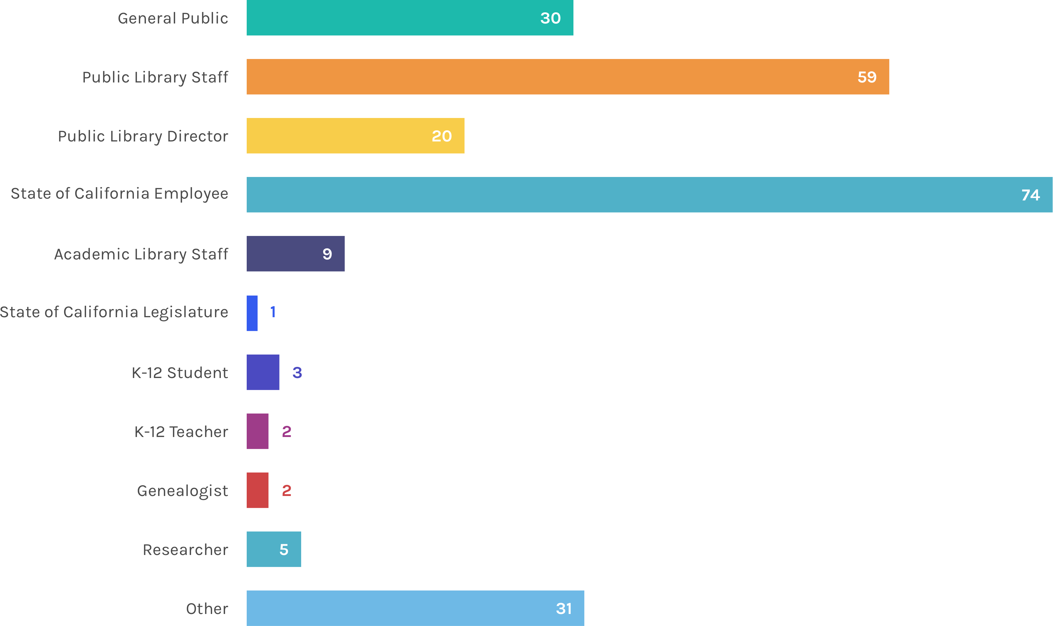
3. Not compatible for their several target audiences. The current audience is comprised of teachers, legislators, service workers, researchers, and the public. The website does not clearly address the needs of these respective groups, and needs to be streamlined so that each group can find what they are looking for more easily.
Deliverables
1. Provide tools to expand user demographic. CSL is hoping to expand their user demographic to the 20-30 age range. They would like to become more relevant and usable for a group of younger patrons who may be dissuaded from accessing their resources due to the nature of their materials and the current website design. Part of our deliverables were to interview users in the 20-30 age range to understand how they could use functionally use the CSL website and wider their demographic range.
2. Extensive content analysis to help decrease the amount of pages. It is difficult to find content on their website because of how many links and pages they have. Some users had to resort to a Google search so they can be directed to the page. The amount of pages results in a poor navgiation system that we will re-structure for a better experience.
The start of an aggressive UX design
Website Surveys
Provided by CSL, we analzyed 200+ website surveys to get a better understanding of our users and their experience with the current website. We were able to identify specific pain points which helped us create our top-level hierarchy. Some of the findings we discovered were:
- There were a lot of returning users, and some returning users said that they already have a designated path to lead them to their goal.
- Accessibility functions (larger fonts, hearing aids) were very much appreciated.
- A lot of the users are not aware of what CSL does or has to offer.
- The search bar functionality did not help them find what they were looking for, so they resorted to a Google search.
- Users believe there is "too much data" and "too many clicks" to find what they were looking for.
In-Person Interviews
Since CSL would like to attract more people between the age of 20-30, we conducted surveys with people between the age of 20-30 to interact with the site. There were 2 parts to the survey. The first part was asking them question about CSL before looking at the website. The second part was recording their interaction and mouse-movements with the website – having them navigate through the website, think out-loud their critiques, and take notes of their interaction. Some of the reactions we got from these interviews were:
"The design reminds me of the DMV...and the DMV is the worse"
"There's a lot of stuff...it's pretty overwhelming"
"It looks more like an archival repository than a library"
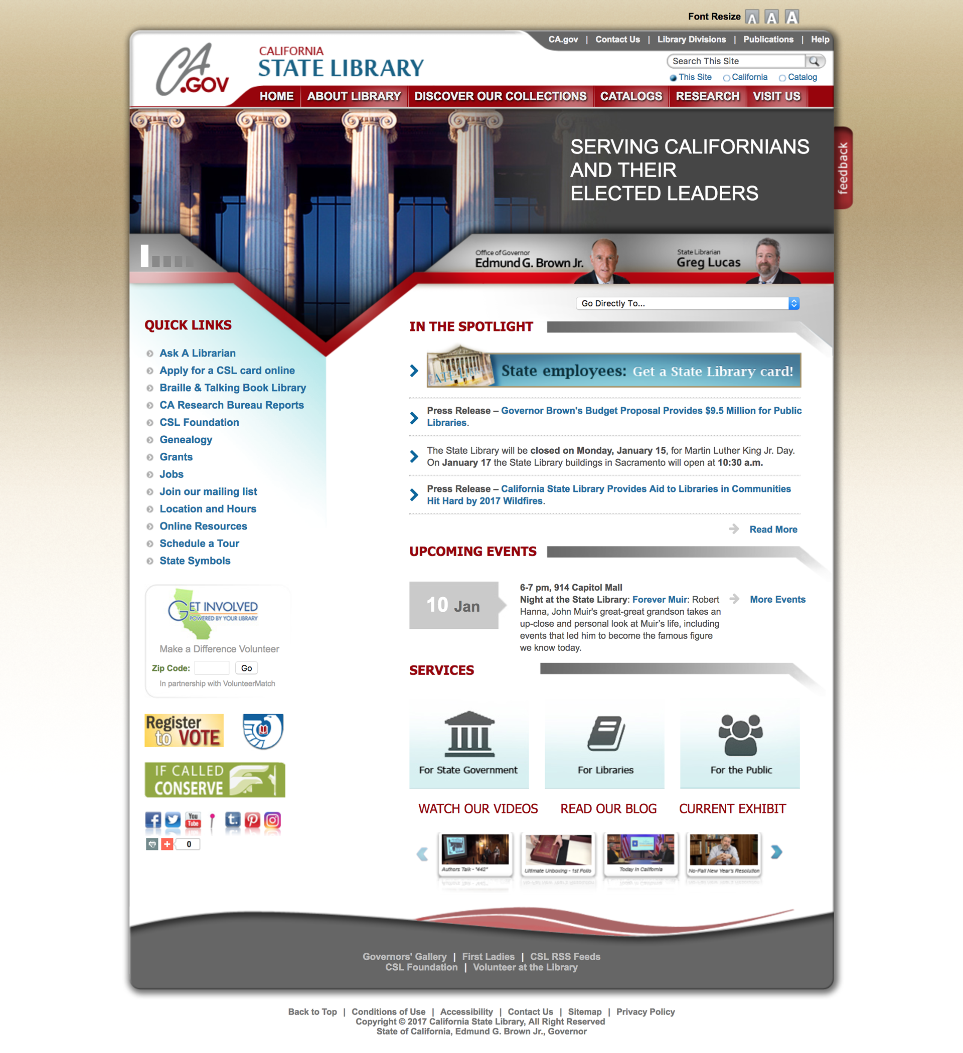
Have you ever gone to a program funded by the California State Library?
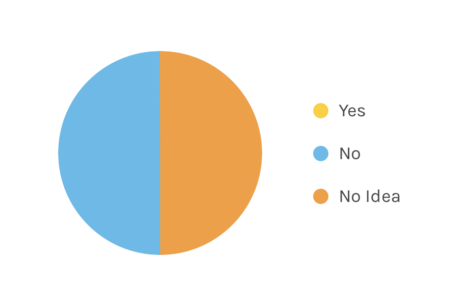
Have you ever used a resource from the California State Library?
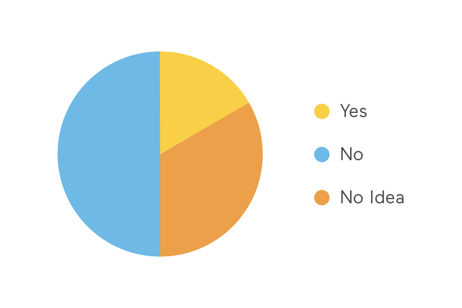
Have you ever visited this site before today?
Google Analytics
CSL granted us access to their Google Analytics. We analyzed and provided a summary of what we gathered. Since they did not turn on search functionality on their website, there was not a lot of information.
Hoarding all of California's archives in one centralized hub.
Using a web crawler tool, we scraped all 600+ pages into an excel sheet so we could see what type of content the website contained. The crawler identified and organized the pages by number of steps it takes to get to that page. We did one quick run through of all the pages noting down a brief description of the page and grouping pages based on description.
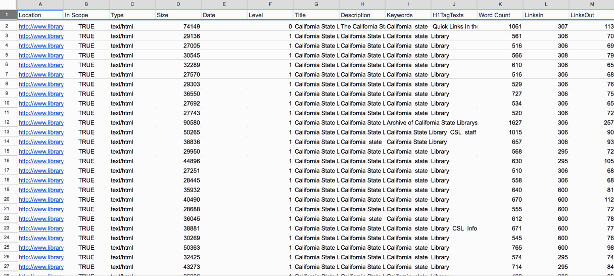
After we analyzed the website, our team came together to talk about our top-level hierarchy. We noticed a lot of pages pertaining to the information about the library – employee information, CSL history, etc. We even noticed that they were constantly updating their blog with books of the week and featured archived photographs from their collection.
According to the website surveys, a lot people commented that they couldn't find any information on grants or statistics, but a lot of people acknowledged the website's amazing accessibility features such as the braille library, eBooks, and large text books. Google analytics revealed that a lot of people were interested in finding jobs at CSL.
Once we established our top-level hierarchy and began sorting all 673 pages into our top-level hierarchy and we even consolidated the pages into further sub-categories.

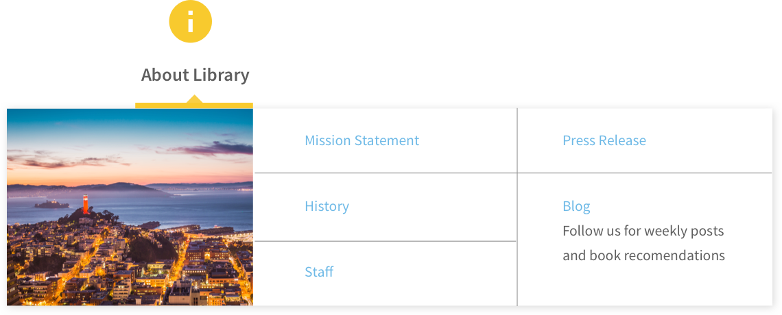
For pages under About Library, we categorized them into: Staff and Employees, Mission Statement, Press Release, History, and Blog
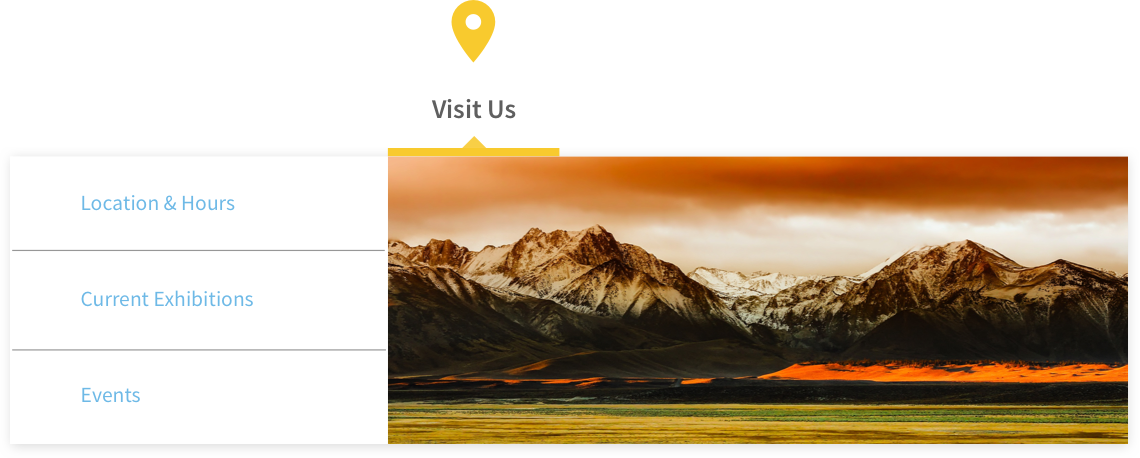
For pages under Visit Us, we categorized them into: Location and Hours, Current Exhibitions, and Events
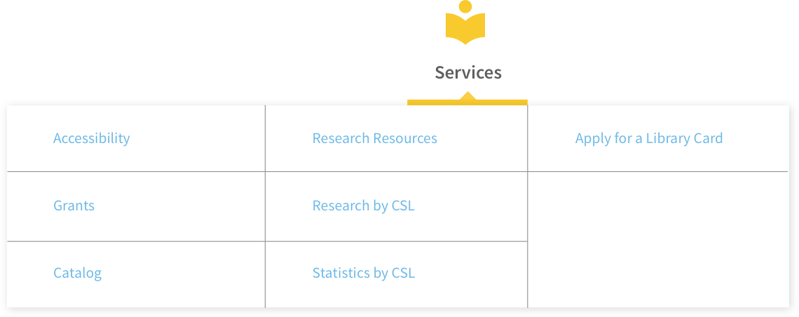
For pages under Services, we categorized them into: Accessiblity, Grants, Catalog, Research at the Library, Research by CSL, Statistics Complied by CSL, and Apply for Library Card
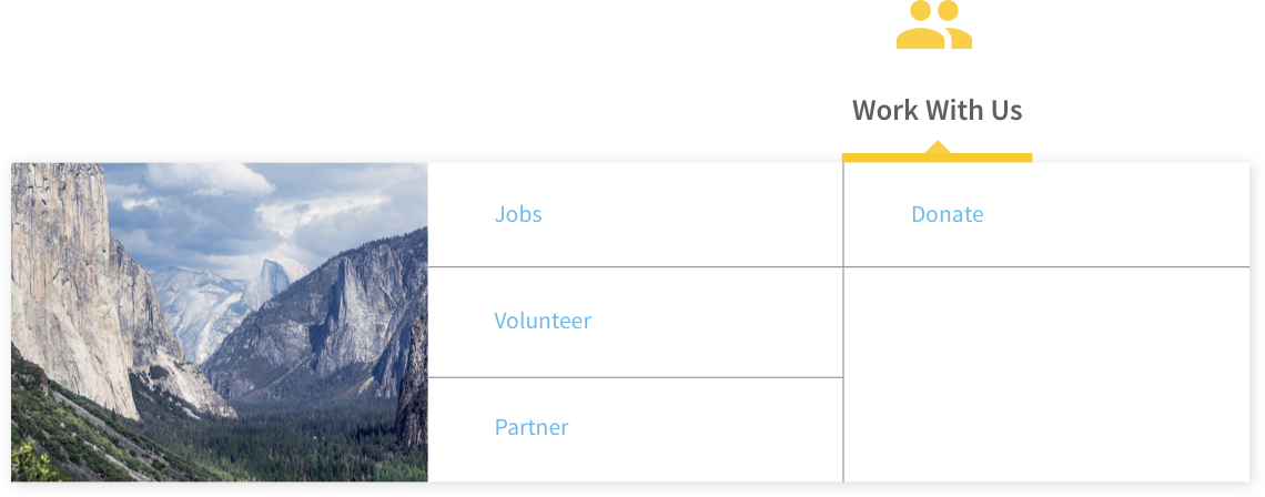
For pages under Work With Us, we categorized them into: Jobs, Volunteer, Partner, and Donate
Since CSL is hub for archived information, we were very cautious on which pages we could delete, so we provided them with suggestions on which pages should be deleted.
The user experience of forms
Our professor, Lynn Boyden, provided us a lesson on creating forms. One of the main features of the CSL website was the ability to sign-up for a library card, so we redesigned their form to improve their user experience. We signed up for a library card to see how their current experience, and we made improvements.
We saw that if you filled out all your information and you are categorized as "General Public", then it will prompt you with a message saying you have to come in person for your library card. The user journey is frustrating especially if you filled out all that information just to be told you have to apply in person. In the beginning, if the user states what department they're in, it will prompt them with the correct form fields.
We wanted to cut down the number of form fields the user fills out. We wanted the ability for the user to type in the zip code and have the city field automatically filled out. When the user chooses which agency they are affiliated with, it will automatically fill out their work address that is saved on government records. Also, if the user's home information and work information are the same, it will auto-populate that information as well.

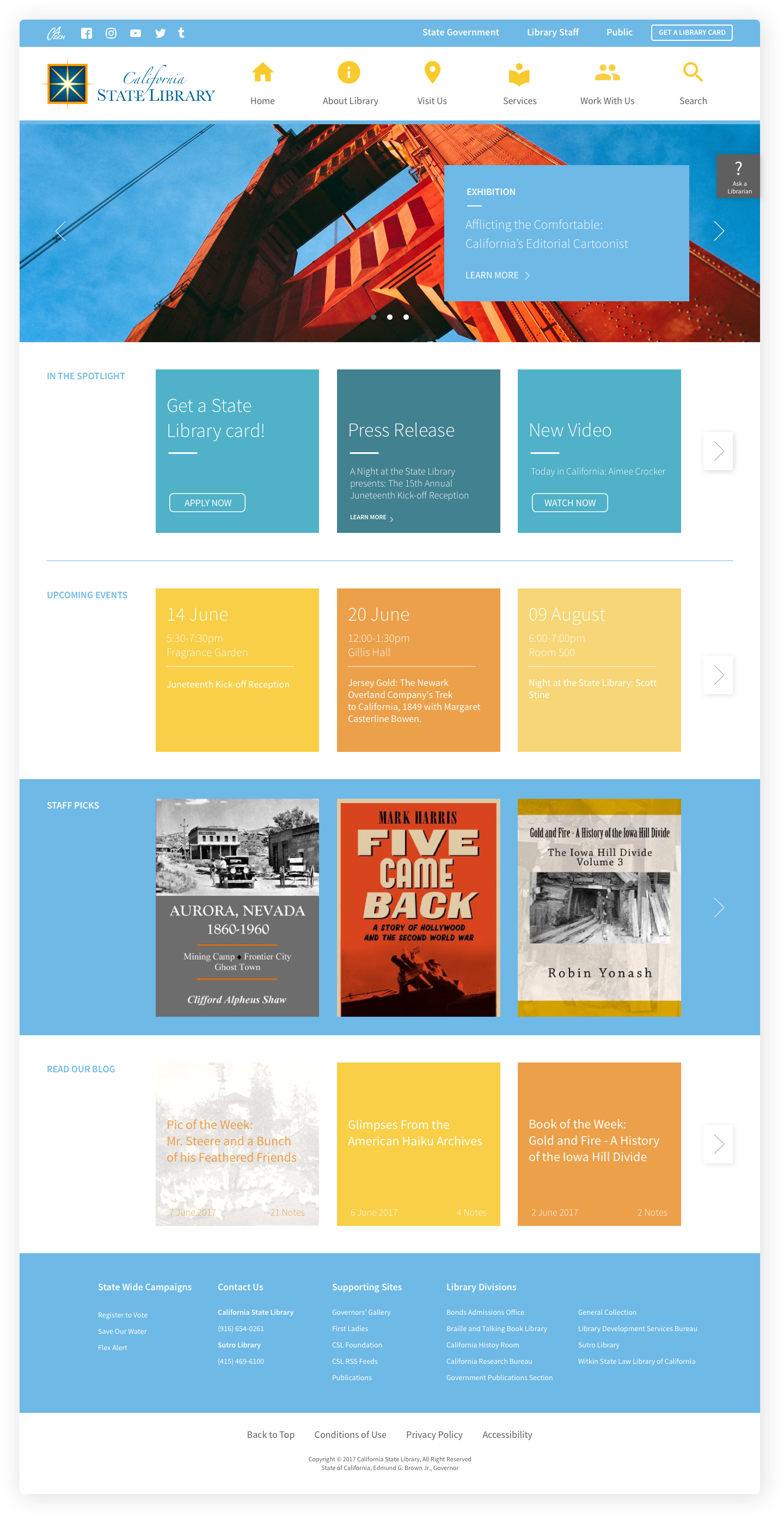
Even though the website looks out-dated, it is because they are not on the latest version of their California Government website template. They are still on Version 2 even though the main California Government website is on Version 5. So, not a lot could be done to change the visual design because it is following a government website template.
As part of our deliverables, we provided CSL with a mock-up of their home page with the Version 5 template. The mock-up included our top-level hierarchy with our sub-level categories in the same jumbo style menu. The card style was also incorporated into their mock-up, but was redesigned as a suggestion.