Previous Project –
AuditBoard
What was once SOXHUB is now AuditBoard.
AuditBoard
AuditBoard is a next-generation, fully generated GRC platform for SOX, operational audits, IT compliance, and ERM.
OVERVIEW
The rebrand from SOXHUB to AuditBoard was a huge milestone for the growth of the company. It shows that they are not just a start-up, but the standard of what auditing software should be.
ROLE
Visual Designer
UX Designer
Web Designer
Web Developer
Logo Design –
From PowerPoint to pixel perfect logo
The SOXHUB logo was already established between our customers, the change to a completely new logo was going to be a difficult challenge. We first provided stakeholders with brand questionaires to get a direction of how they wanted their new logo to be perceived.
In order to get the company more involved in the logo process, we ran focus groups and asked employees which logo they liked and to provide an explaination. We ran these focus groups using a point-system. Everyone was allowed 3-points and they could use each of their points to vote on one or three different logos. Using their data, we elimnated logos that our employees thought did not represent our brand.
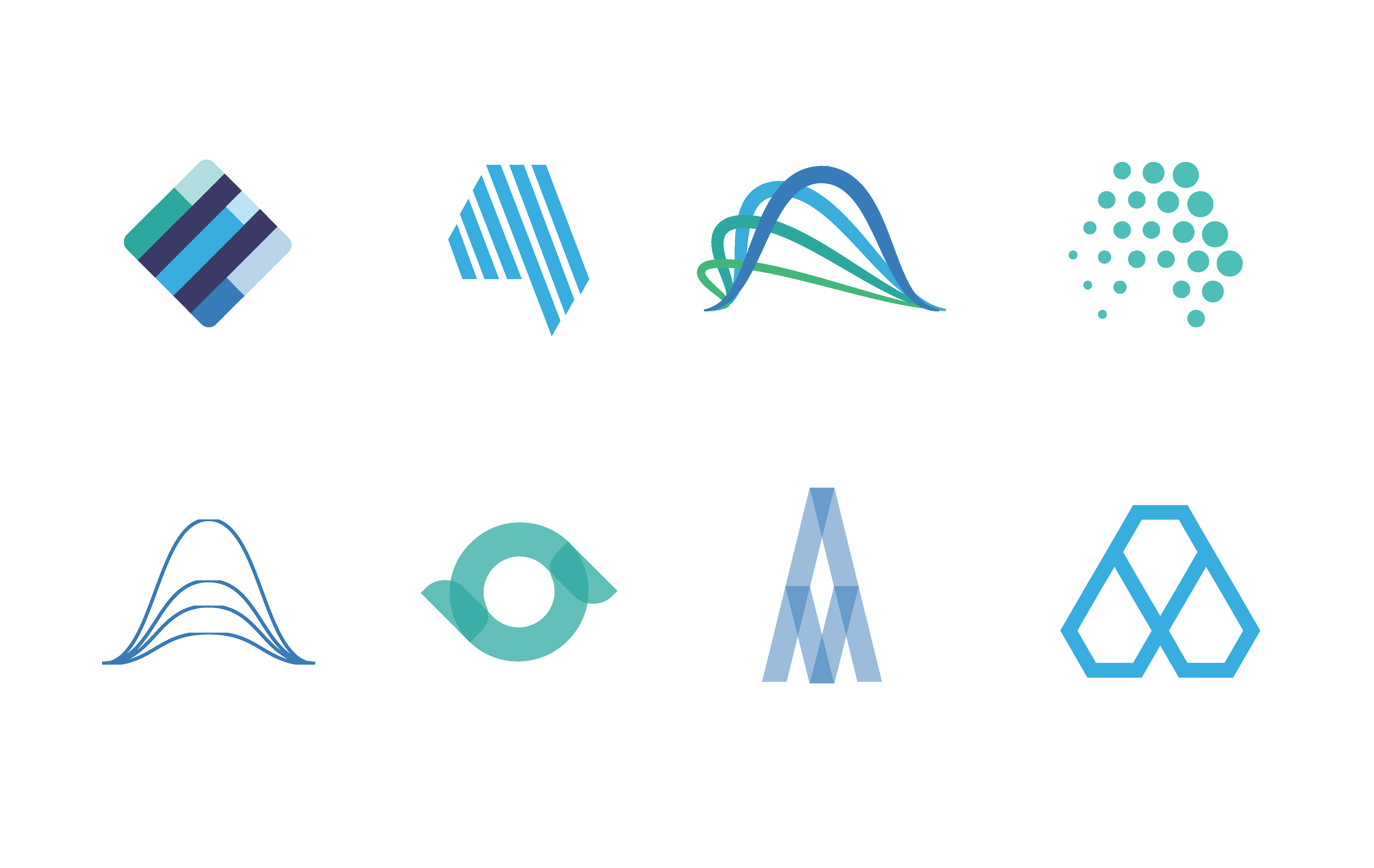
Logo iterations
Throughout many iterations and focus groups, the census agreed on the final logo. The shape of the AuditBoard logo represents unity, coming together, and centralization – a big element in what makes our product stand out from our other competitors. The shape of the logo also combines the letters "A" and "B" as a tribute to our new company name.
The SOXHUB logo got a fresh redesign and would be the new name of our award-winning SOX Compliance software. OpsAudit, ERM Oversight, Compliance, and WorkStream are all products under the AuditBoard platform and were redesigned to fit the rebrand.

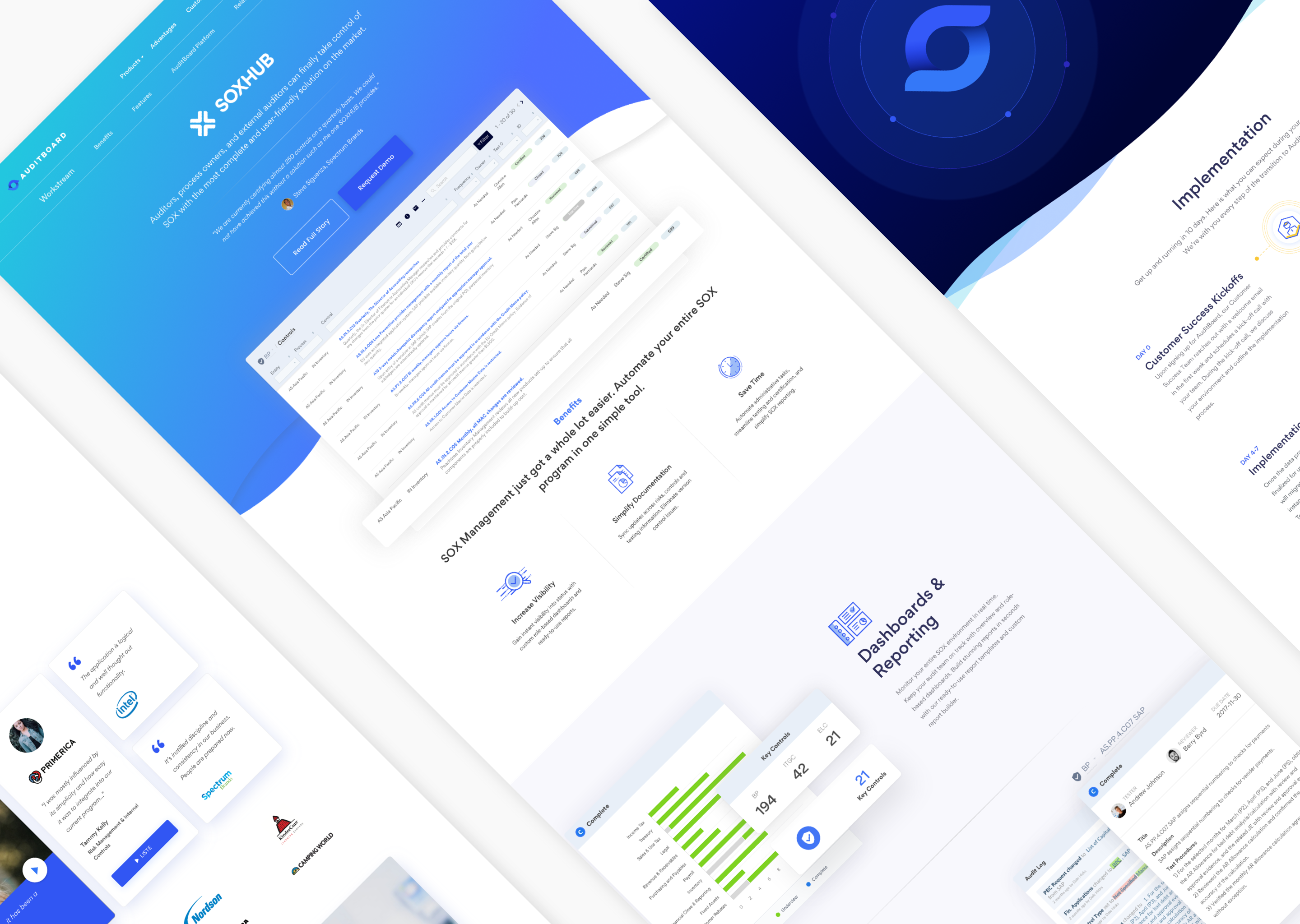
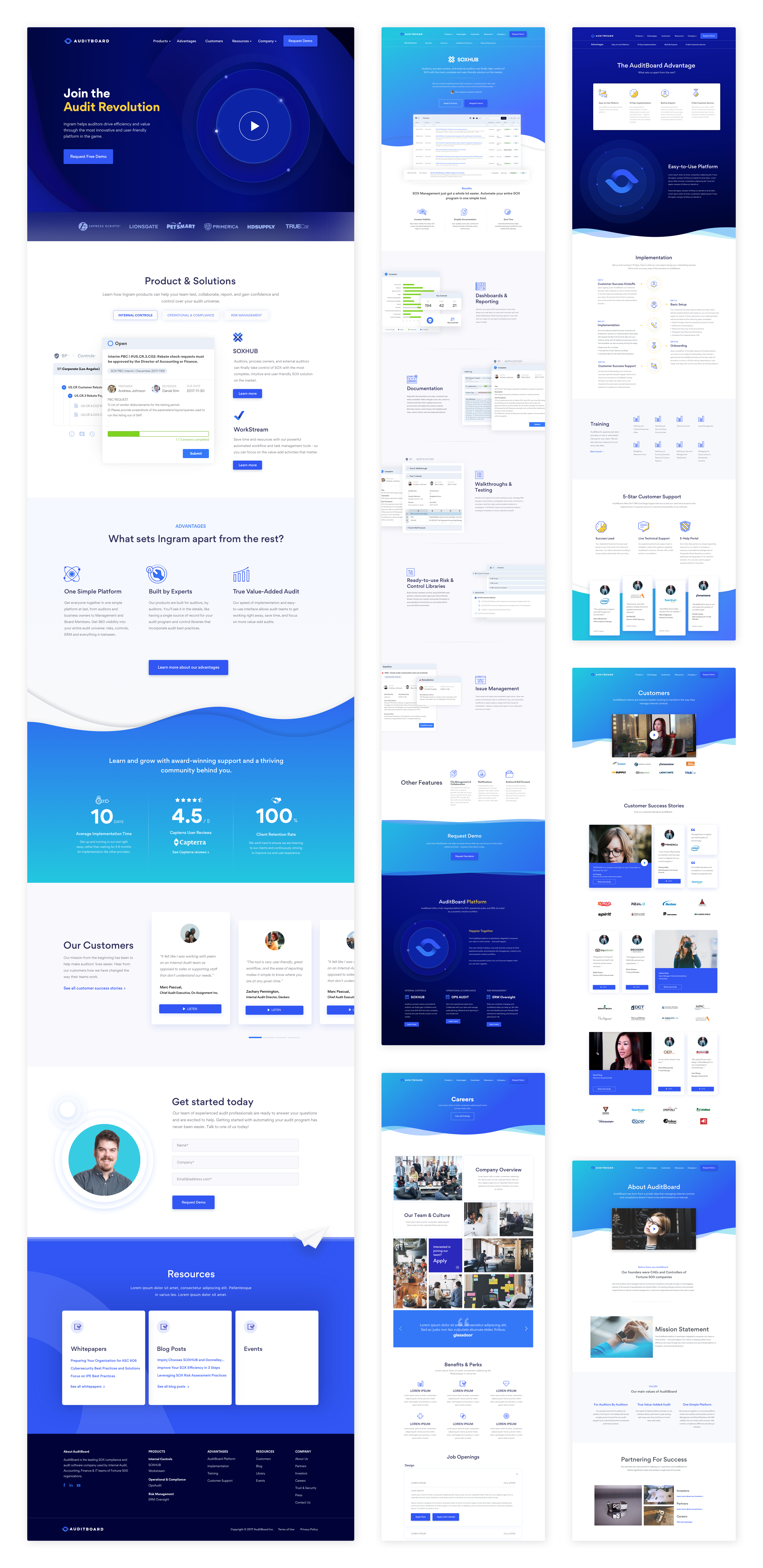
Website Design –
The balance between start-up and credibility
As a start-up in the audit industry, our target audience are typically older, less tavy-saavy users. Potential customers will want to research our company to confirm our credibility, and our website will be the first thing they look at. The goal of the website was to provide them with as much information about our platform expecting that it would convert into a demo request.
I was in charge of the entire informational architecture, user experience research, low-fidelity wireframes, and high-fidelity wireframes. I also implemented a majority of the website and cleaned up the code for future web designers to manage.
Google Analytics & User Research
The first part of the UX research was anayzing the traffic of the website. We used Google Analytics to track bounce rate, exit rate, landing pages, and much more. We also set up a heat map set up so we can identify hotspots throughout the website. Some integral findings were:
1. Less than 25% of users would look at our SOX Compliance product, and less than 5% would look at our all our other products. SOX Compliance is the product most company focus on buying, but our other products are equally as important to a company's growth.
2. More than 50% of users drop-off after landing on the home page. Most auditors like to see all their information up-front, but having a 50% drop-off rate shows that they were not interested in looking into our product.
3. Low goal conversion rate. The main goal of the website is to have users request a demo. Our goal conversion rate was under 2%, and the main goal was to increase that percentage.
Problems
1. Lack of internal linking throughout other products. Our platform is optimized when all products are intergrated together. The old website displayed our product as individual cases rather than a package.
2. No clear solution for potential customers. Our products were just displayed on our website with no clear solution of what our products solves for the user.
3. Lack of benefits from our product compared to competitors. We have competitors, and we know we our product is the best solution for auditing. We needed to prove our credibility but also show our advantages versus other competitors.
4. Poor visual design. In comparison to other start-up websites, ours looked very dated and needed a fresh design.
Solutions
1. Categorize products by "solution". Our top-level navigation divided the products into three main categories: SOX Compliance, Operational, and Risk Management. Now users can see what type of audit software they want and see
2. Integrate pages with linking throughout products. Individually, our products are the best, but together they are even powerful and we wanted to show our users that having one or more of our products would benefit their company.
3. Create an "advantage" page dedicated to all our advantages over our competitors. Putting our Advantages pages as a top-level hierarchy shows users that we are better than our competitors and we have proof.
4. Improve visual design of everything. After all the user research and meeting with stakeholders, we received input from the low-fidelity wireframe to the high-fidelity wireframes to make sure our website was the in user experience and user interface.
Sales and Marketing –
Tying it all together
The last part of the rebrand was redesigning all the current sales and marketing materials. Materials include: booth designs, brochures, packaging, presentation decks, business cards, and much more.
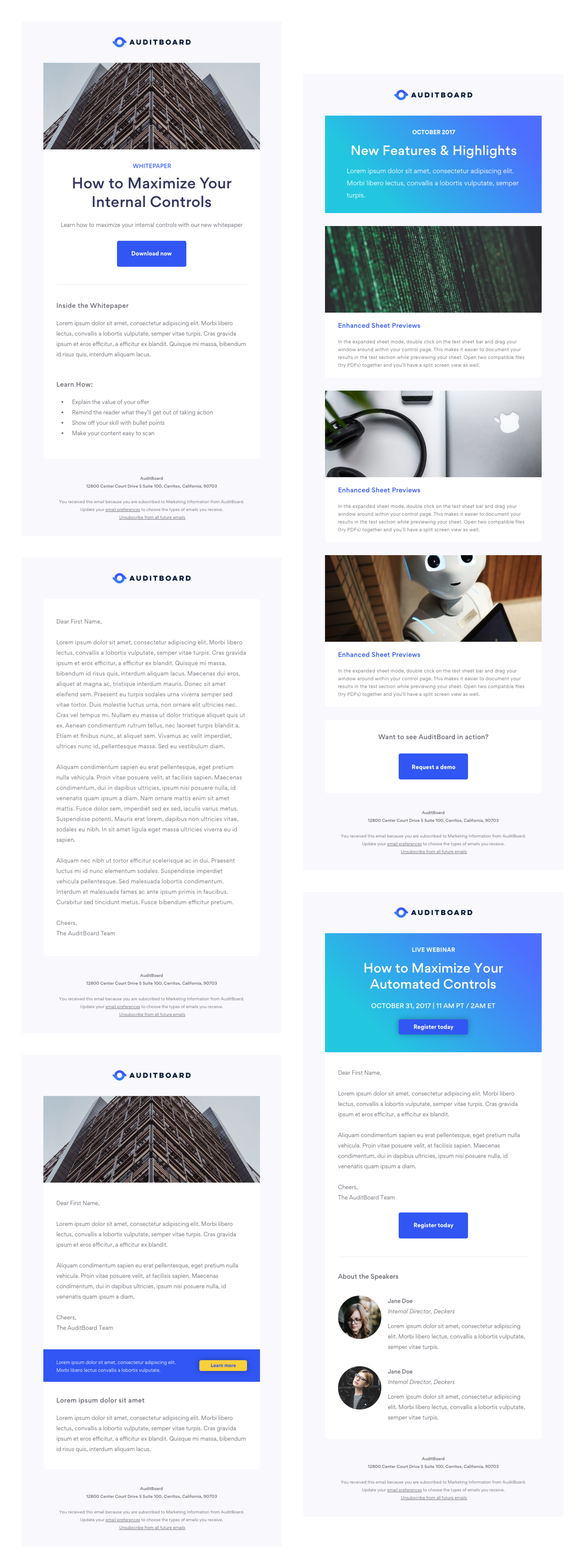
I was in charge of redesigning and building all landing pages and marketing emails. The conversion rate for the marketing emails increased from a 12% to 24% click rate and the landing pages increased from 2% to 16% conversion rate.